About: Ahn Sang-Soo
Ahn Sang-Soo was born in Chungju, South Korea in 1952. He graduated from Seoul's Hongik University where he then became a professor of the fine arts. Later he was promoted to the head of the school of graphic design. Over his lifetime he has written fifteen book on design related subjects. He received a commendation by the Korean Language Academy for his contribution to the advancement of Hangul or the Korean Language. Along with this, in 1983 Ahn was chosen as Designer of the Year by "Design Magazine." From 1997 to 2001 Ahn acted as the Vice President of Icograda (International Council of Graphic Design Association) where he implemented many international workshops. Finally in 2001 he organized TypoJanchi, a international typography biennale that takes place in Seoul. TypoJanchi is credited for bringing designers all over the world together in one place.
Identification
|
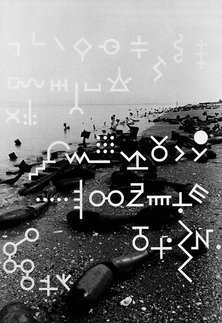
Even though I cannot read what this says, it is an eye catching piece. The proximity look to be together because I can see that certain words are grouped together. Not only that but each text line is justified creating a better flow to the image.
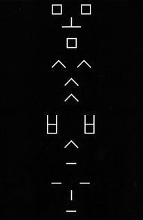
This piece caught my eye because of the alignment Ahn used. It is clear that he went with a center alignment which give the design a balanced and comfortable look. I would also like to bring attention to the white text on a black background, in contrast to the white text on a picture background in the last picture. It gives the design a more clean and precise feel. Right away my eye notices the grouping done in this design. One letter rotates every new group, until the third and then a symbol is replaced with a new one. Once again the simplicity of the black text on a white background makes the design pop and easy to read.
|
Critique
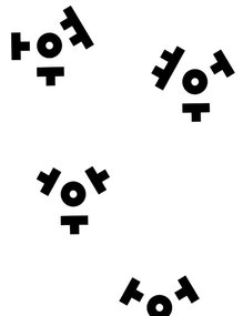
While looking Sang Soo's work I noticed his proximity usually does not leave room for margins and almost always kisses the sides as evident in the first and third picture. I would also like to note that from someone who does not know how to read Hangul, it is a little bit difficult to determine where to look first and understand the flow of the writing. However, Soo's unique take on layout is eye catching and keeps me coming back for more.
Reflection
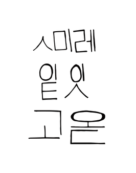
For my recreation I decided to write in Hangul and center the work. However, in my piece I left space for the margins and used the same techniques we learned when making our quotes. I also applied the things we learned about photoshop in order to produce my piece, I wrote out "smile, today is a good day" in Hangul and decided to use a black text on a white background. From Ahn Sang-Soo I have learned a new way to layout my text and use alignment.
