|
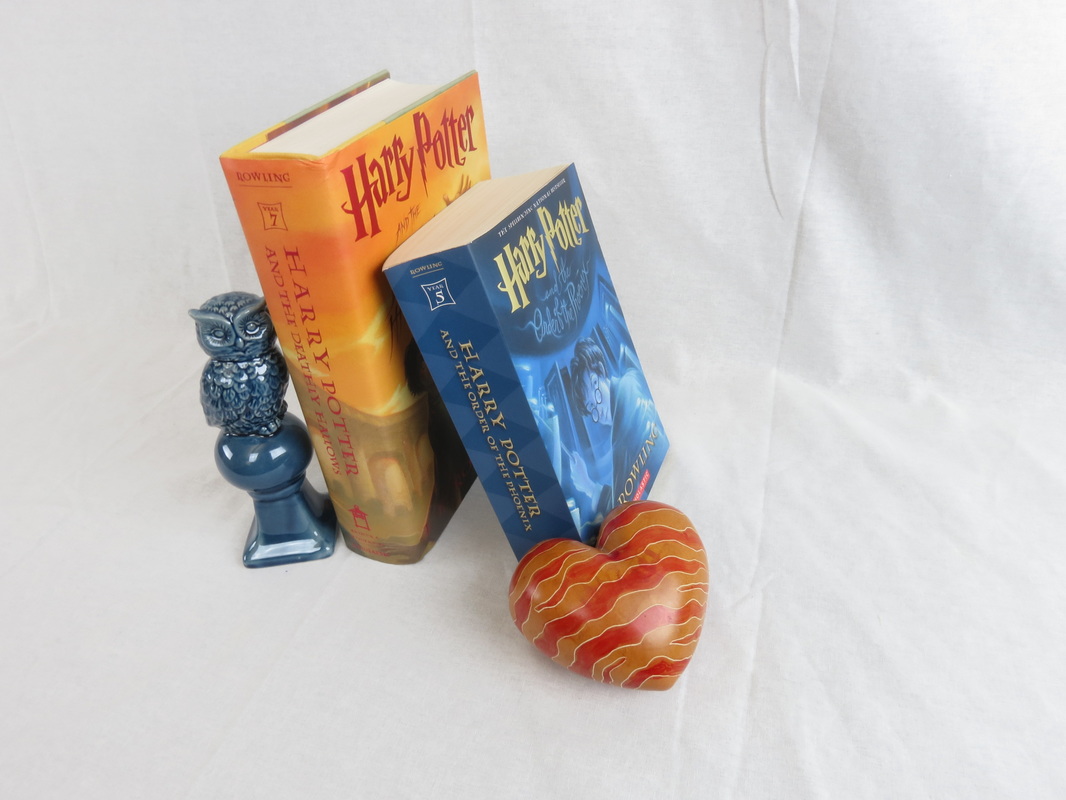
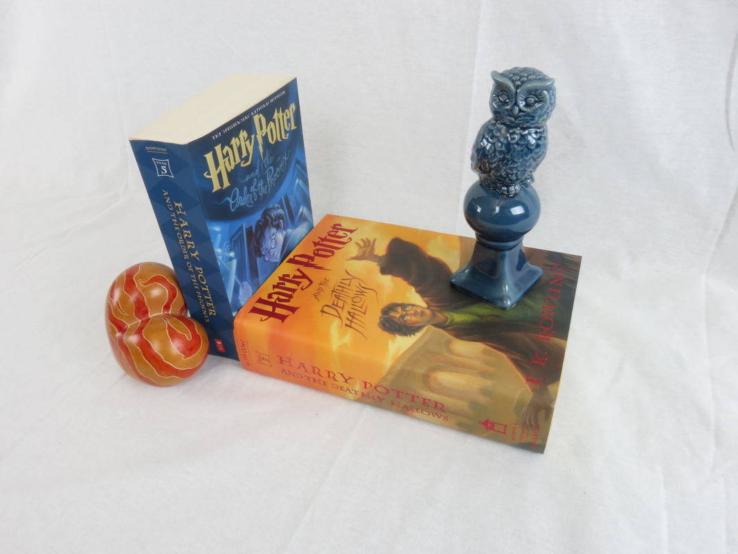
11/16/2016 0 Comments Still Life and ColorFrom this project I really learned how to use color contrast in order to make the subject pop. I also learned how to set up the props so that they would stand out to the eye. By doing this project I discovered I really like taking still life photographs because I can manipulate the objects to do whatever I want them to do.
0 Comments
11/11/2016 0 Comments Color in Photography The first tip is to use strong bold colors. Deep saturated colors create a dramatic photo. The key to using bold colors is keep the composition simple. An example of this is how in Greek Islands most buildings are white with accents of blue. Taking a picture of a window frame where the frame itself is white and the shutter is blue. The second tip is to use subtle pastel colors. To achieve the perfect photo using this concept the lighting should produce barely any shadows to give it a soft feeling. A few pastel colored flowers on a neutral background with this lighting would give the photo a light, simple, and dainty feeling.
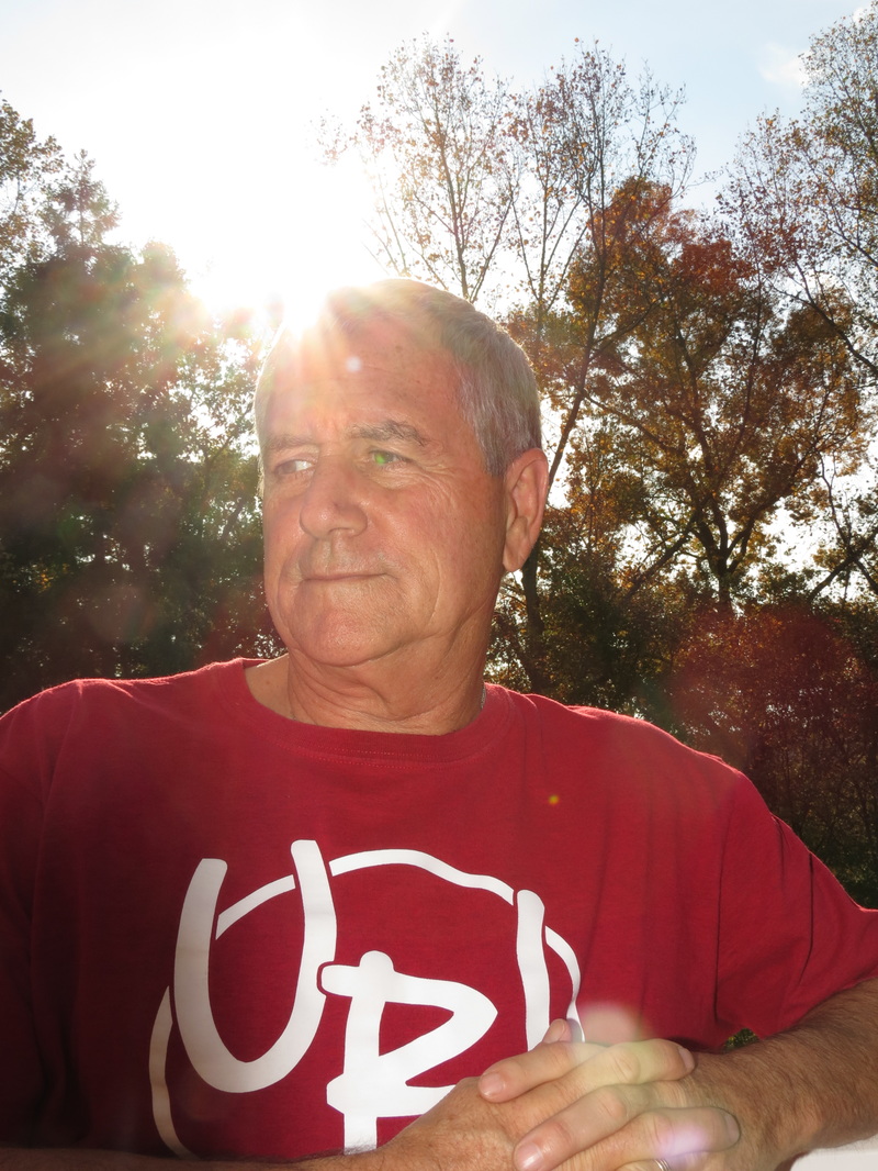
Using one color against a neutral background emphasises that color because there’s no competing hues. This effect would help the audience focus on the subject instead of being distracted by any other colors. An idea to display this concept is to putting a few brightly colored books against a white or tan background. Furthermore, having the background be textured yet simple really advances the picture and makes it more appealing to look at. Another factor to benefit the picture is if the neutral background is in shadows to project the subject as the focal point. The next tip is letting one color dominate the photo. The effect of this tip is stronger when the color primary. This is commonly seen as a subject against a solid colored wall. An additional way to to use this tip is having most of the objects in the photo be the same color. The color balance is important to any photo because it creates a contrast. To achieve a calm feeling, use colors that are located close together on the color wheel. To have a higher color contrast use colors that are located on opposite sides of the wheel. It is important to remember warm colors stand out against cool colors. An Example of this could be a yellow tea cup on a blue green dish. You can give your photo a mood by setting it to the wrong white balance. This tip is called Color Temperature. Cool colors balance warm colors when the cool area is much larger than the area of warm color. Therefore, to create a balance, place a small patch of warm colors against a large area of cool color. A picture of a blue sky and open blue sea with a streak of red from the rising sun would balance the picture out. Another instance of this is a picture of a christmas tree in the dark covered in bright christmas lights. The last tip is using color to express an emotion. This is important because the emotion you feel from a picture helps sell the story you are trying to share. It also affects how you feel about the piece. For instance, a picture that uses a lot of blue could give you a cold, sad feeling. The color red universally often gives a feeling of danger, anger, or even love. On the other hand, green gives a fresh and vibrant feeling. The same way color can send out an emotion, the lack of color, or black and white, is also very powerful. If I wanted to impact someone’s view on homelessness I would take the picture in black and white because it is much more dramatic and powerful. Color is a key concept to think about when taking pictures because it has a big impact on how the audience views the picture. It is also a tool you can use to get the viewer to focus on the subject of the picture. You can do this by having the focal point being a more dominant color. A master of photography that uses these techniques is Ernest Haas. He uses dark tones and natural shadows, invoking color emotion, to elevate his photographs. In contrast, Trey Ratcliff, a contemporary photographer, uses bold colors to drawing your eyes to focal points in the picture. However, he too takes advantage of darker tones and colors. Both artists’ work is incredible and amazes the eye. I personally lean more toward Trey Ratcliff’s work because of the bold colors that capture my attention as well as the things he takes pictures of. By reading the article and looking at other photographer's’ work I have learned how to incorporate color into my picture in a way that will draw the viewer in. I also learned how to properly balance my pictures using Color Temperature. Finally, I learned how to properly use bold and soft colors in my pictures. 11/3/2016 0 Comments LightingThis project really taught me all the ways you can use lighting to advance your picture. Taking advantage of the sun can really give your photos a really professional look. This unit also helped me practice my angling a lot in order to get the subject in front of the sun.
|
This is a record of my work for intro to digital imageryWrite something about yourself. No need to be fancy, just an overview. Archives
November 2016
Categories |


 RSS Feed
